Thoughts about Ugly Pictures
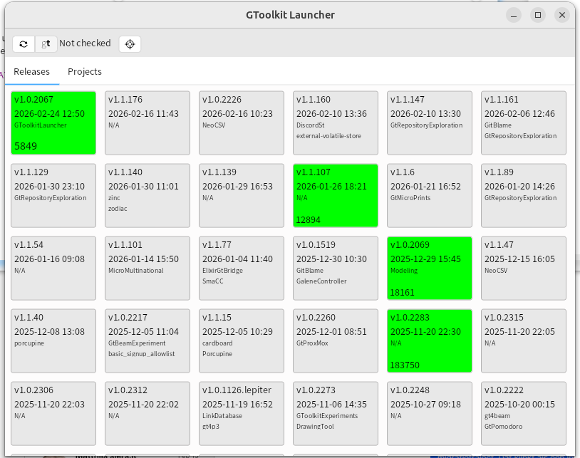
We steer software development with visualizations. They nearly never look as nice as the ones we typically put on Keynote or PowerPoint presentations for the board. Missing legends, no great layout, lots of accessibility issues. Why do we do that?
Static vs dynamic
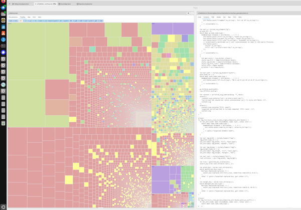
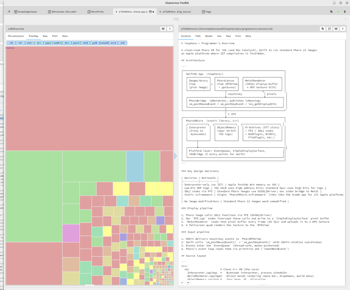
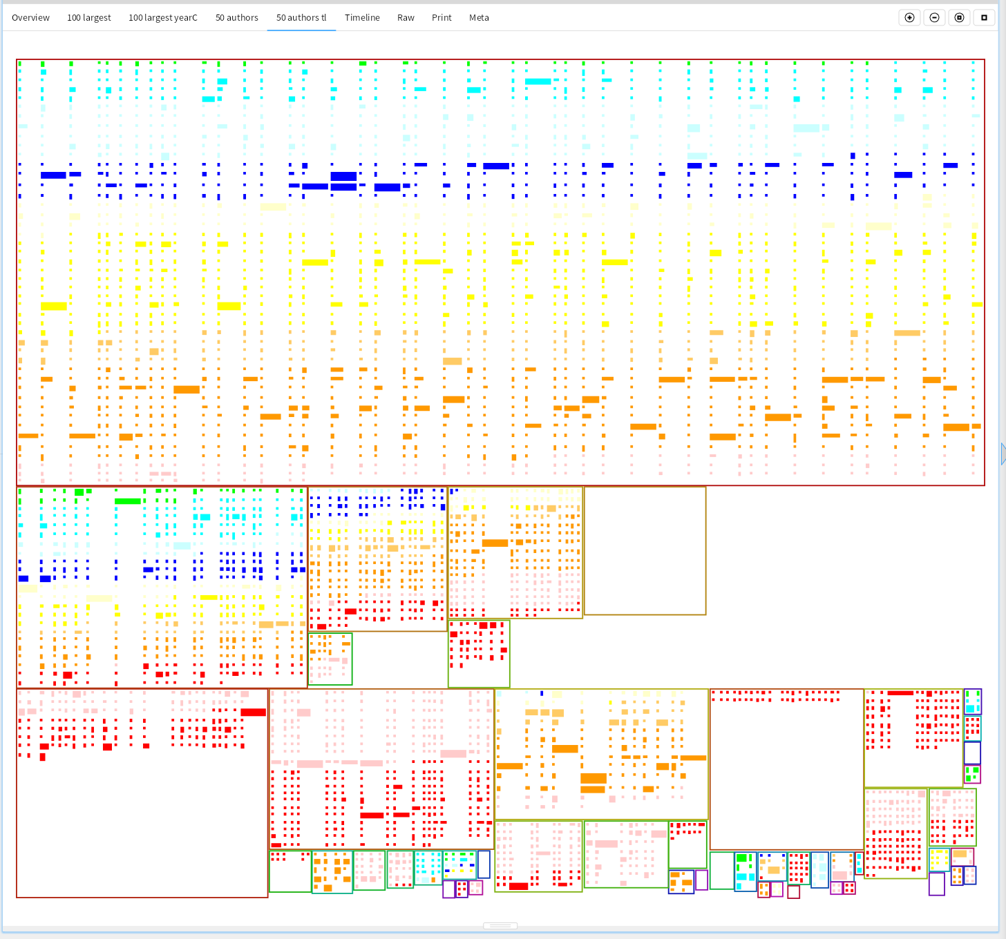
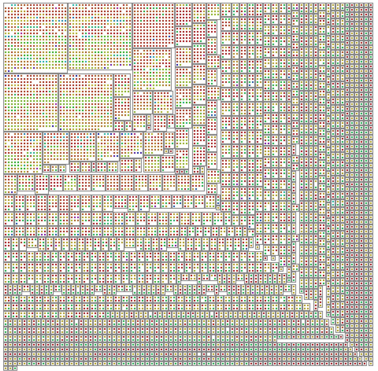
With GToolkit, the picture itself is only a static representation. In the integrated environment we add user interface to these pictures. We click on elements or hover over them to see detail inspectors and other views on the same element.
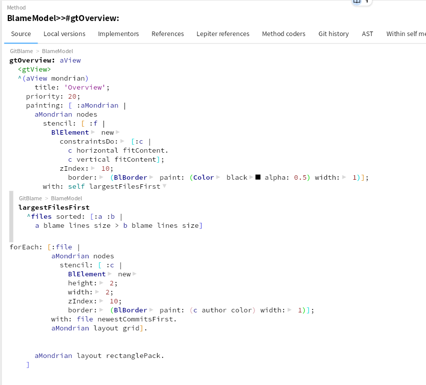
A legend of the picture is also easily within reach: a command-click on the tab showing the visualization shows the source code of its definition. And that can not get out of sync, like a static legend can.
Information density
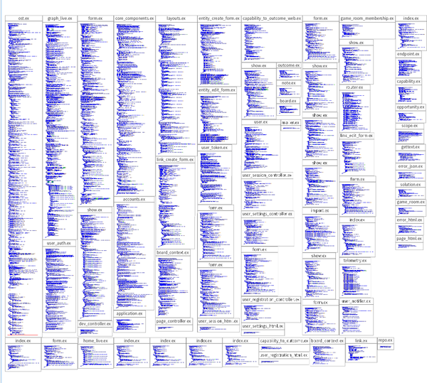
The pictures we make are helping us make decisions. We deliberately use our human pattern recognition abilities to show both the whole, and interesting details. As we often don't know yet what might be interesting, we show many different dimensions at the same time, and make the details so small, that we can still just discern the differences. The public for the ones we show here is the relevant stakeholders that need to make the decisions. They normally have background knowledge that we don't need to put in the picture, or a short verbal explanation of a few sentences is enough to help steer the decision.
Fast feedback cycle
These visualizations are cheap to make, they can often be made in 10 minutes. That makes them part of the inner plan-do-check-act (PDCA) development cycle, where we have an hypothesis about the system that we can quickly verify. We keep them if they help us later explain with perfect hindsight how we could have done ideal development, or if we need decisions by or explanations to other stakeholders. And yes, we can make them beautiful too.