Consul Democracy in 15 pictures
Yesterday, I was at FOST Amsterdam where Lucía Luzuriaga presented Building Digital Democracy: Code, Community, and Trust. She describes it as:
As governments seek more inclusive approaches to decision-making, open-source civic technologies are playing an increasingly important role. Consul Democracy is one such platform, enabling participatory processes like consultations, participatory budgeting, and collaborative policymaking.
This talk will explore how open-source can support transparency and public trust, while also addressing the practical challenges of maintaining contributions, governance, and long-term sustainability. We will share lessons learned and discuss why a strong, international civic tech community is essential for advancing digital democracy.
That is interesting, so let's take an hour to take a quick look at the code with a few different models, which all show different aspects of the project.
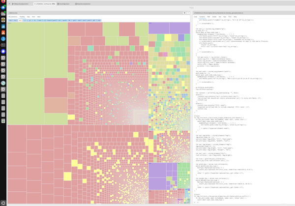
A size-based one-level deep heat map, colored on file type
GTRepositoryExploration gives us this visualization.
repos := #('consuldemocracy').
loader := REXLoader root: (FileLocator home / 'consuldemocracy') repositories: repos .
loader repositoryFormat: 'git@github.com:consuldemocracy/{1}.git'.
loader cloneAll
overview := REXOverview on: loader root.
overview loadAll
Looking at all files by size in the tree map view does not make much sense yet, that is dominated by the pack file
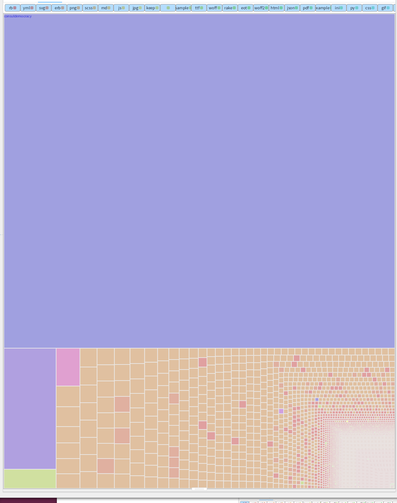
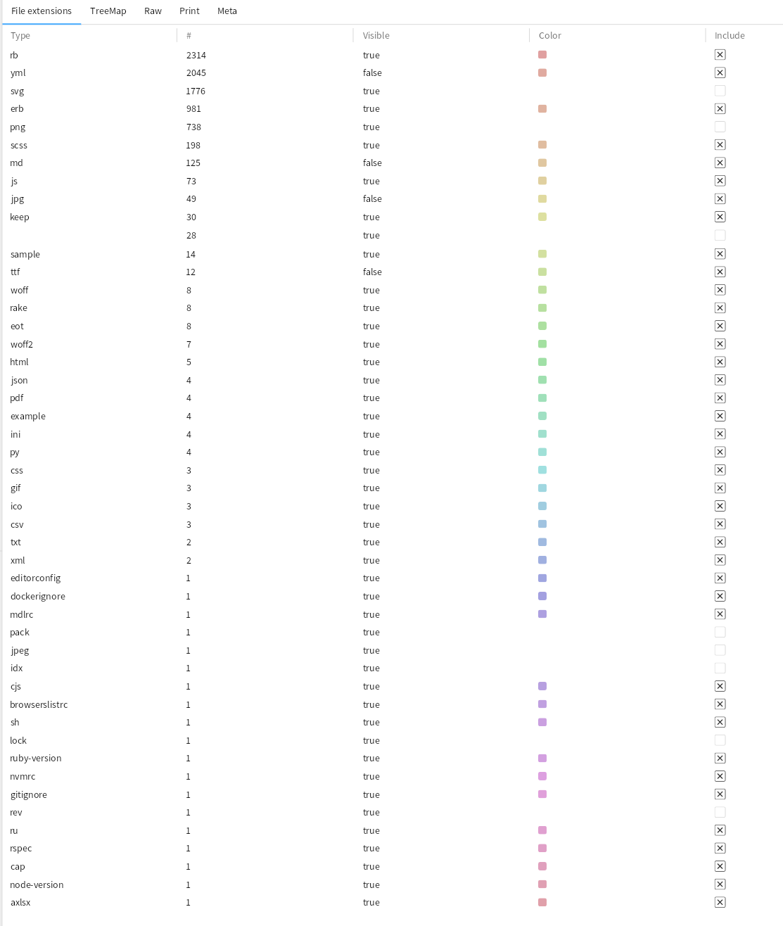
Let's exclude the file extensions that are in the way of understanding. Deselect .pack, .idx, .rev, typical pictures (svg, jpeg, png), and some others that don't look interesting. That leaves us with lot of Ruby code and Yml.
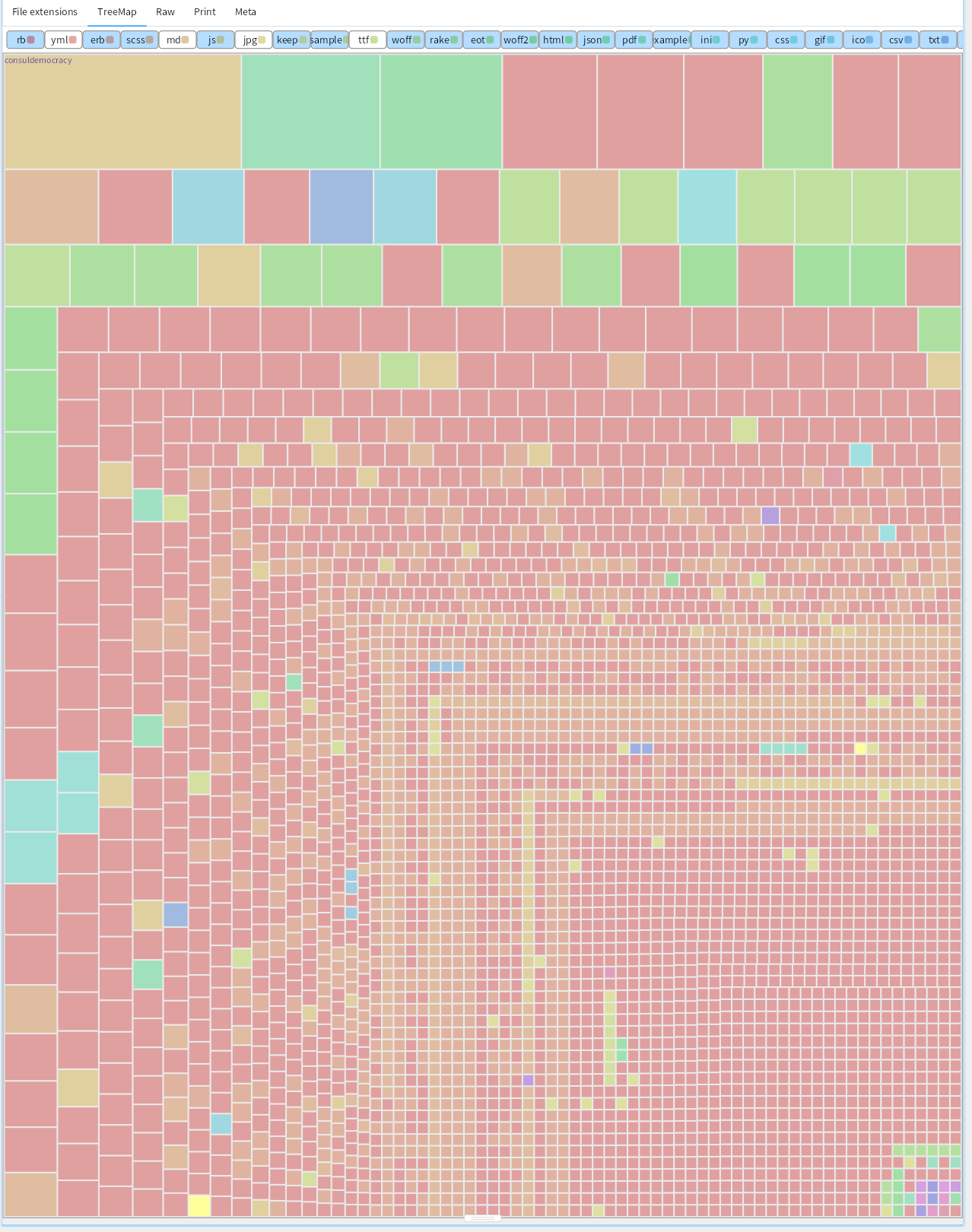
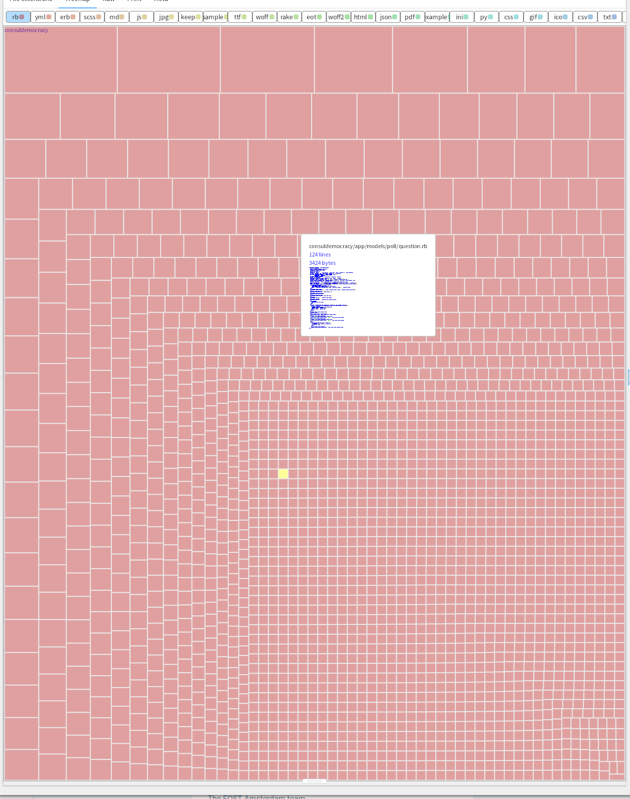
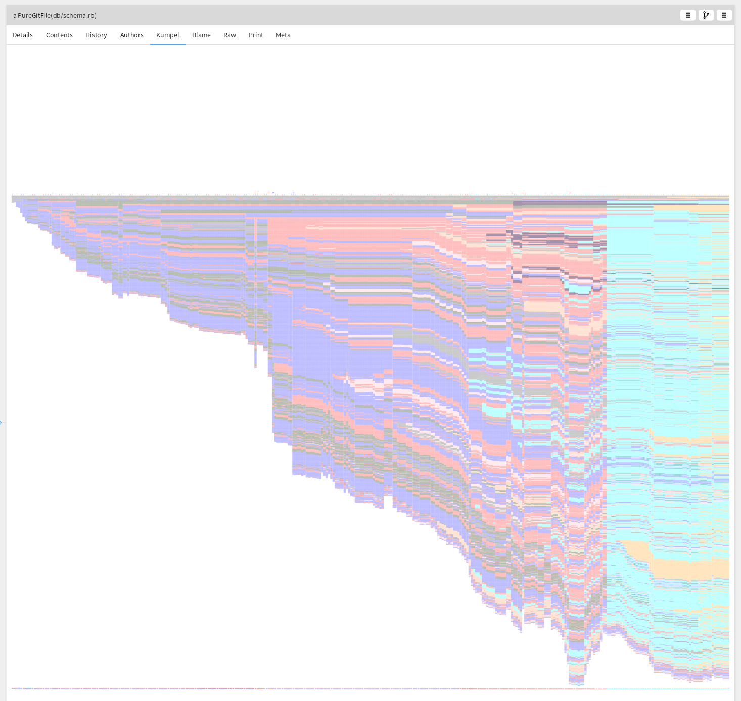
Zooming in on the Ruby code. Distributed functionality over many files of reasonable size, the largest is 1823 lines, and that is db/schema.rb and auto generated.
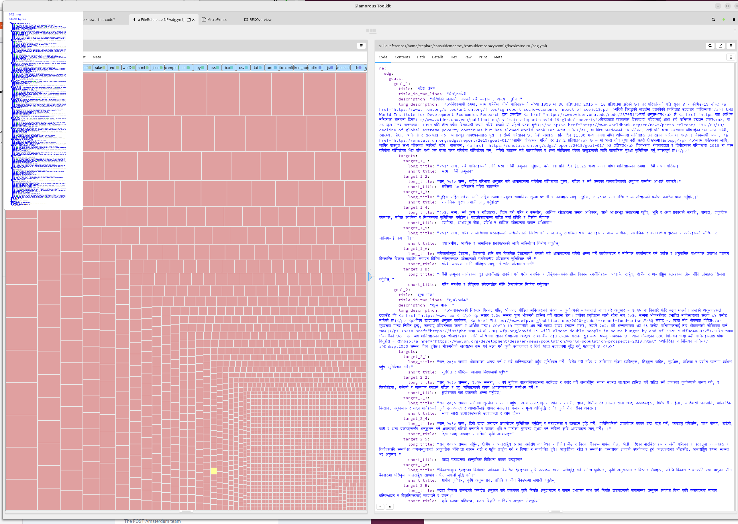
The YML contains translations.
Looking with a nested heat map at files with lots of changes
Let's take another look. What files in interesting directories have seen a larger number of changes?
heatmap := GtHeatMap new.
heatmap root: '/home/stephan/consuldemocracy/consuldemocracy/'.
heatmap interestingDirs: #('app' 'config' 'db' 'lib' 'spec').
heatmap earliest: '2020-01-01'.
heatmap latest: '2027-01-01'.
heatmap minCommits:10.
heatmap collectCommits
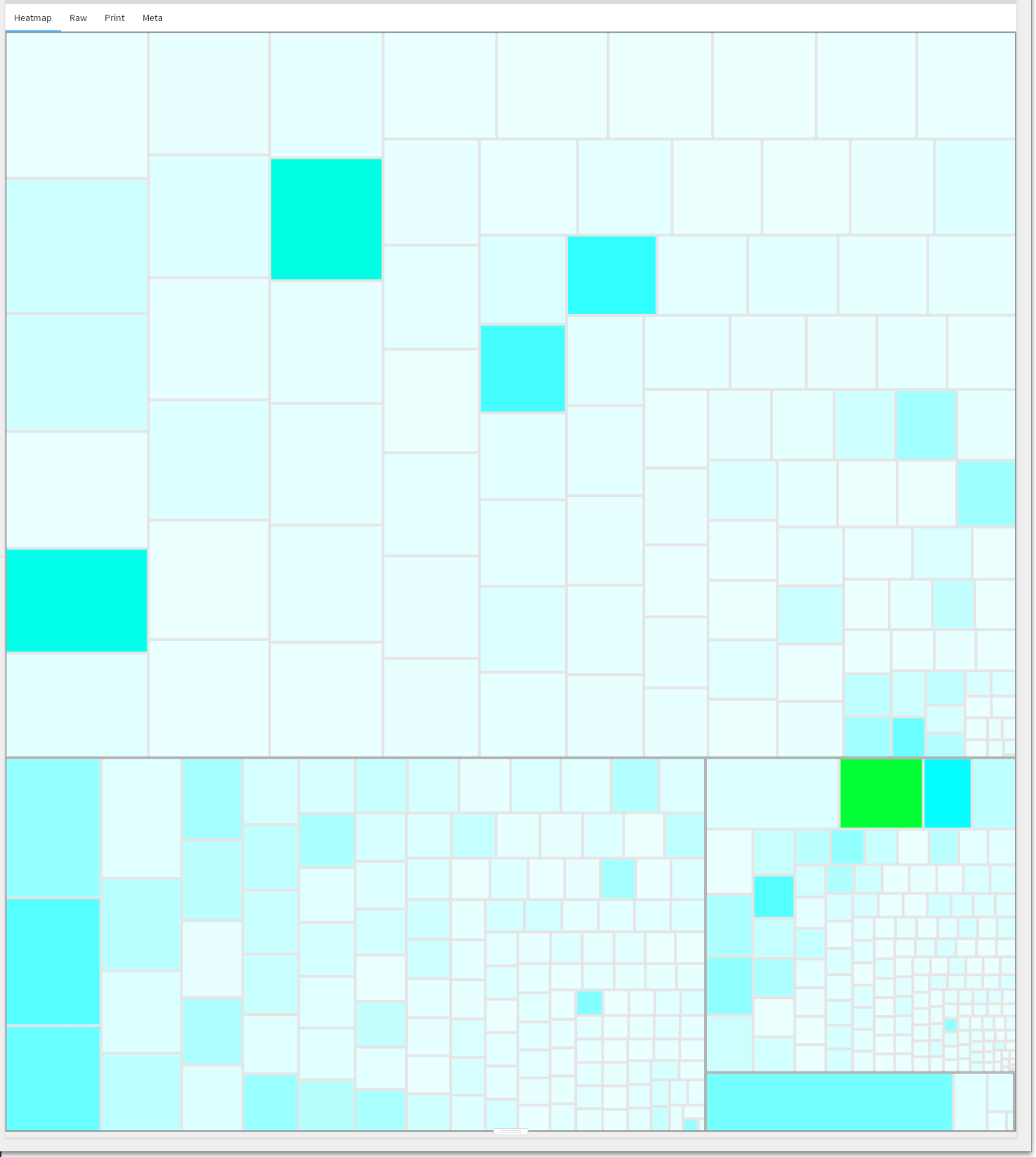
Layout.scss has by far the most changes:
On the Ruby side the number of changes are lower:
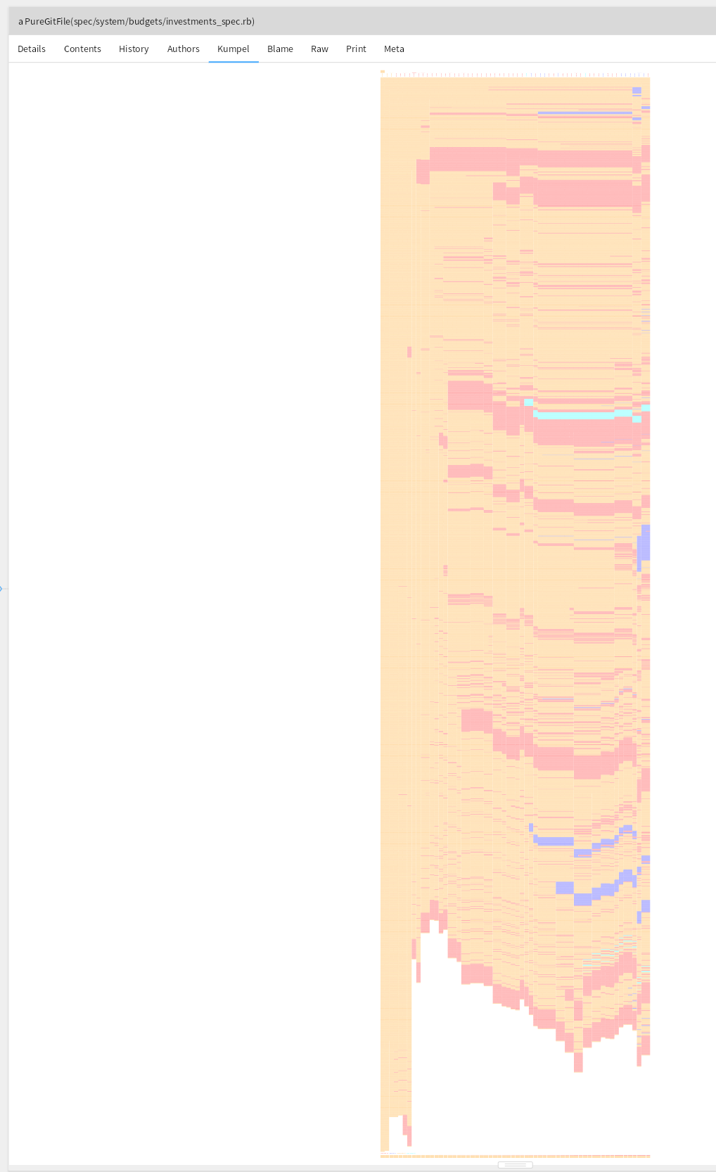
The database scheme shows the expected near-continuous growth:
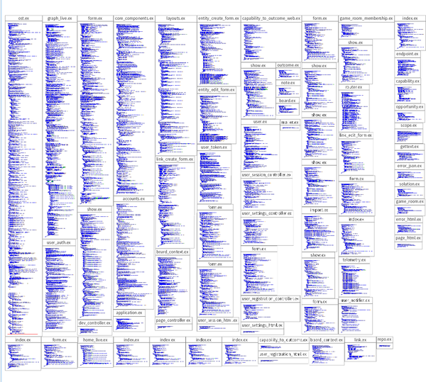
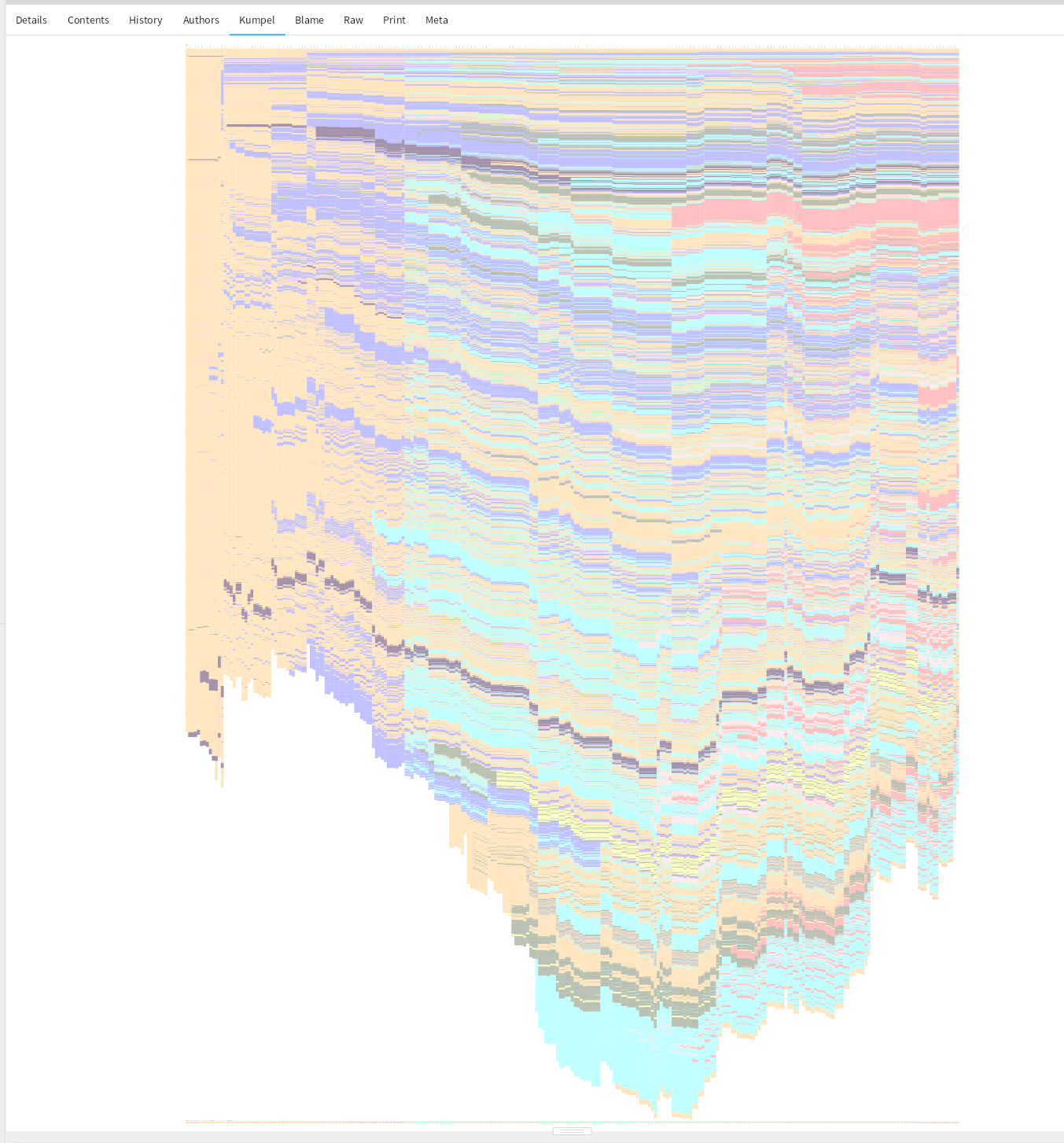
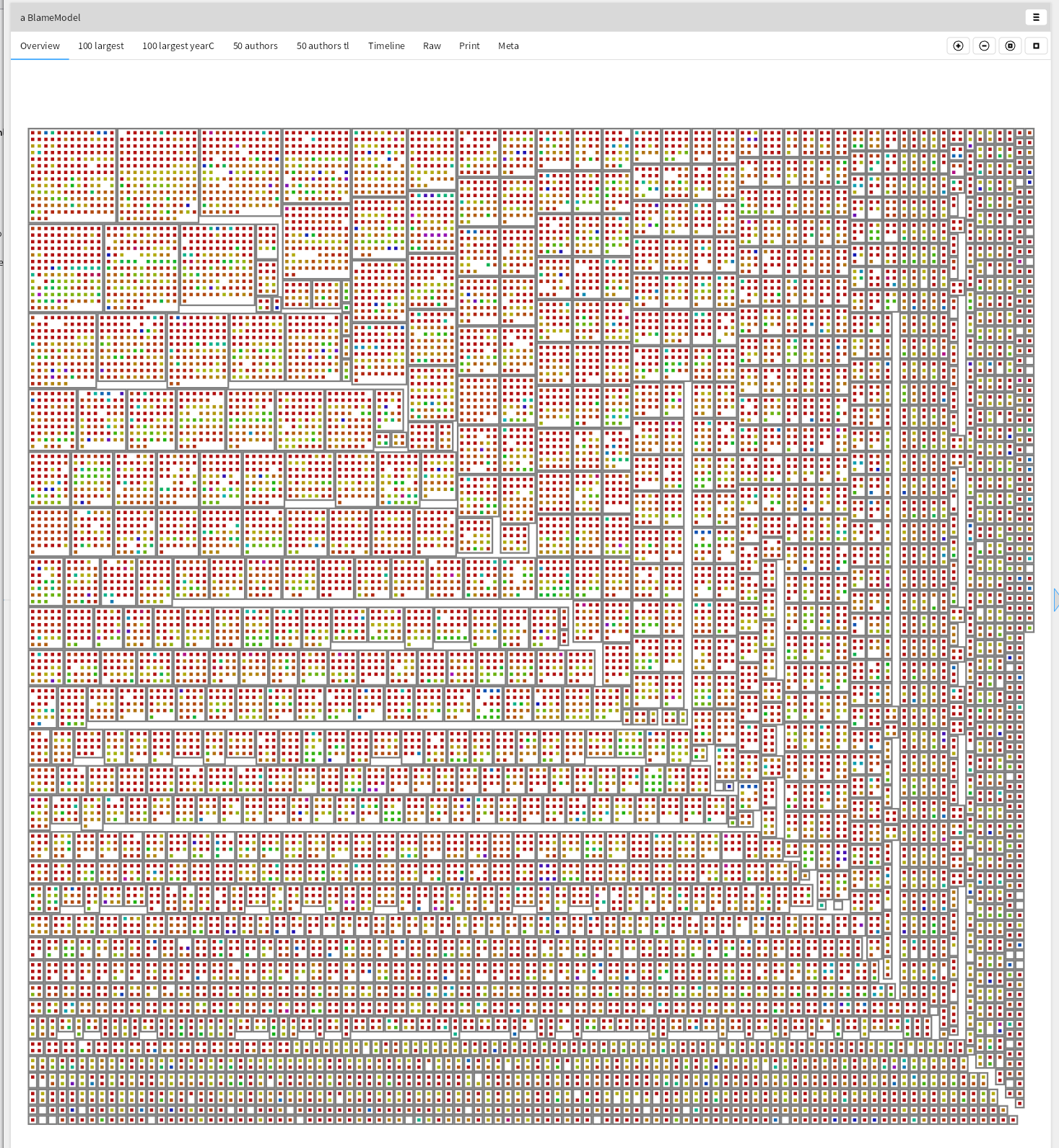
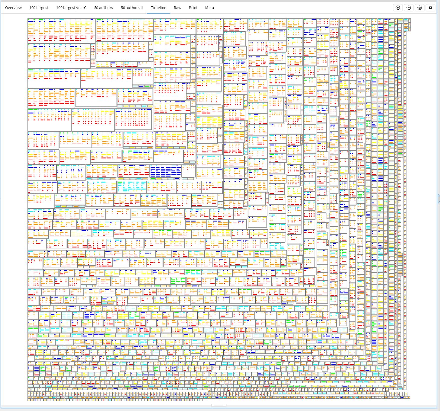
Looking with a blame model
GitBlame tells us for the current source code in which commits were responsible for it, on a line basis. Let's take a look at the ruby files.
rootDirectory := '/home/stephan/consuldemocracy/consuldemocracy/' asFileReference.
model := BlameModel on: rootDirectory.
model addFilesMatching: '*.rb'.
model runBlame.
model parseBlameFiles.
model assignColors```
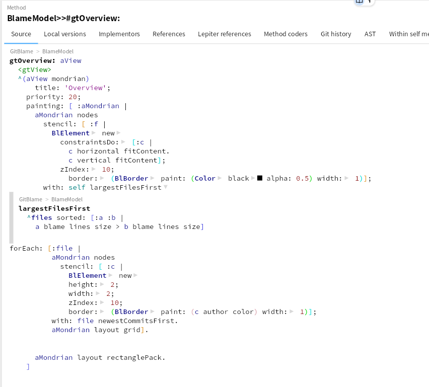
The first overview shows for each file, its commits. The commits are sorted by date, newest first, and are colored based on the author. The files themselves are sorted based on the size of the file.
These pictures take only a few dozen lines of code, once the domain model exists.
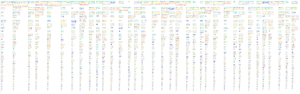
For the 100 largest files, let's take a more detailed look. How large were these commits?
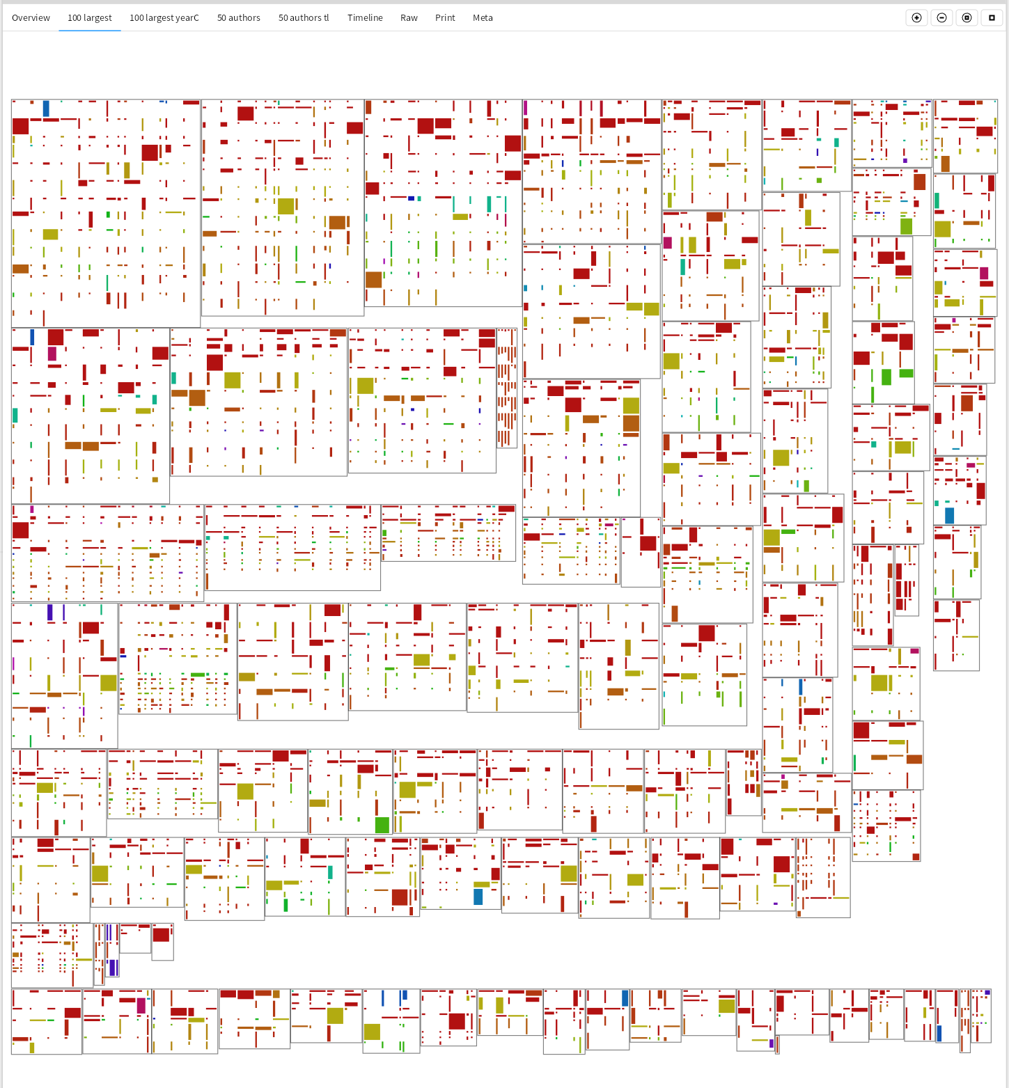
gtHundredLargestYear: aView
  <gtView>
  ^(aView mondrian)
    title: '100 largest ';
    priority: 30;
    painting: [ :aMondrian |
      aMondrian nodes
      stencil: [ :f |
        BlElement new
          constraintsDo: [:c |
            c horizontal fitContent.
            c vertical fitContent];
          zIndex: 10;
          border: (BlBorder paint: (Color black alpha: 0.5) width: 1)];
      with: (self largestFilesFirst first: (100 min: files size))
      forEach: [:file |
        aMondrian nodes
          stencil: [ :c |
            BlElement new
            height: (((c chunkFor: file fileReference) lines size * 2 ln min: 20) max: 2);
            width: ((c chunks size * 2 ln min: 20) max: 2);
            zIndex: 10;
            background: (c author color)];
          with: file newestCommitsFirst.
        aMondrian layout grid].
      aMondrian layout rectanglePack]
The height of the nested rectangles is determined by the size of the change to this file, while the width is determined by the number of changes in the commit itself.
Are those files old, or are they still changing a lot? Current year is green, and give the past 10 years a color.
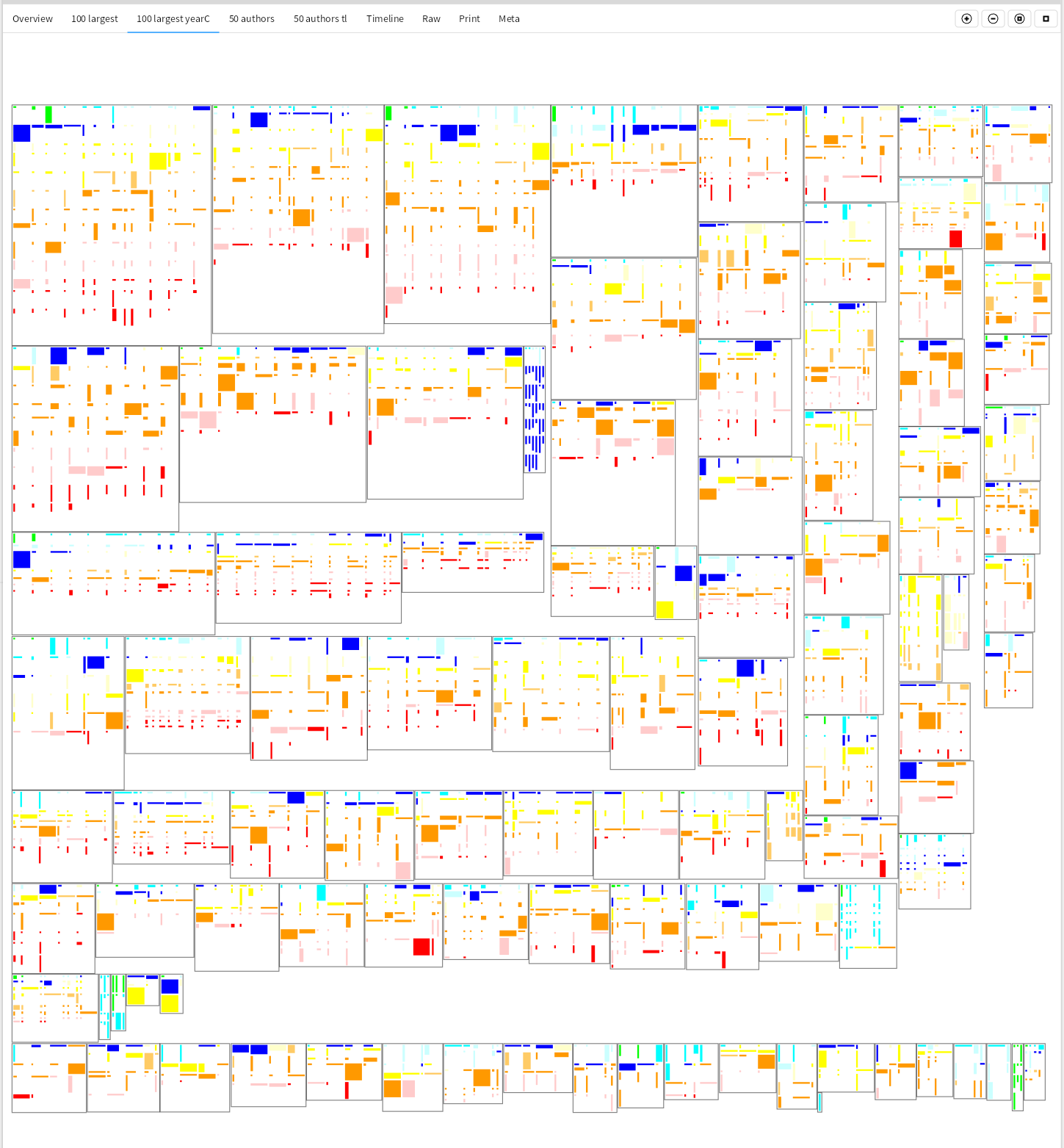
yearColor
| yearColors |
yearColors := #(green cyan lightBlue blue lightYellow yellow lightOrange orange lightRed red white).
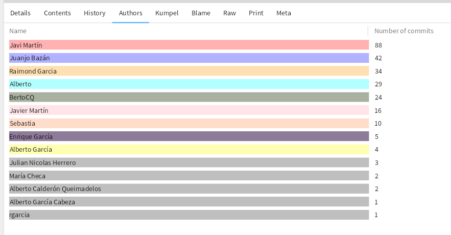
^Color perform: (yearColors at: ((Date today year - dateTime asDateAndTime year)+1 min: 11))```Who is making all these changes? The 50 authors making the most changes, and color and size them based on how large the change was.
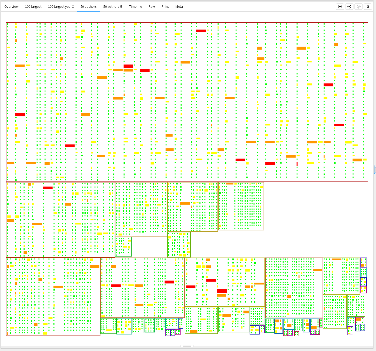
The most prolific author made 2041 changes, the second 498. But are all these authors still active? 13 authors committed changes in the past 3 years, 17 seem no longer involved in making changes directly.
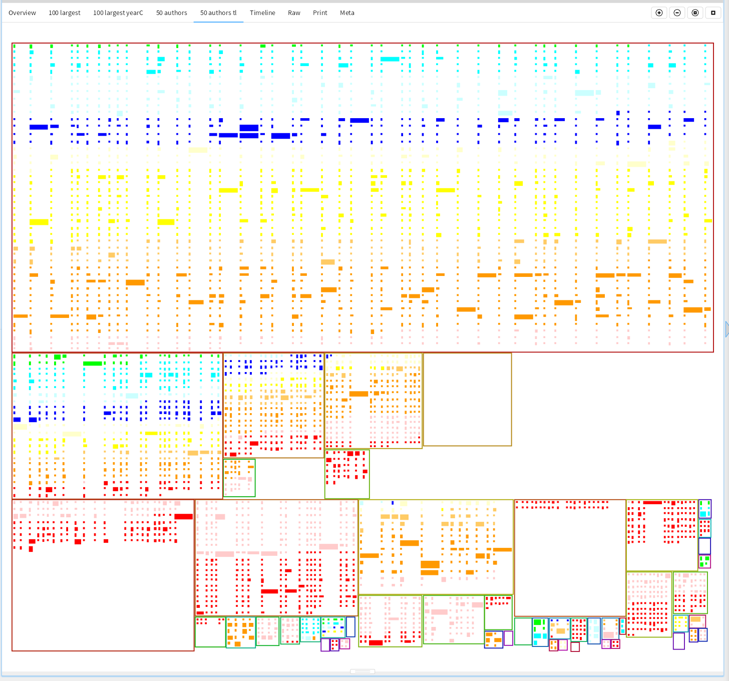
Are changes still being made everywhere in the project?
Because these visualizations take only a few dozen lines of code, they can be quickly changed to show other aspects of a project or code base. This only used the source code, and many more interesting pictures can be made when connecting this to Jira/Confluence/SharePoint and other sources of project info.