Who knows this source code?
When I get into a project with existing software, I need to know whom to ask for help if I don't understand something. The source code repository can tell me who made changes to which parts, when they were done, and in what way they were made. It is useful to know if the experts are still in the team, or if I should expect to do a lot of discovery myself. It also makes a lot of difference if there are multiple people knowing their way around all the code, or if there areas only touched by one expert. And which parts have been stable for a long time, vs the parts that seem to have to change each time the software is changed? Let's take a look at how we can see that.
How do we get the data we need?
GOV.UK Pay develops in the open, so we can take a look at one of their repositories and get some insights. I've cloned the alphagov/pay-connector repository, and installed GitBlame in GToolkit.
While looking at all changes can in some cases provide more insight, focusing on the current code is often enough. git blame -c provides for each line of a file in which commit it was last changed.
After inspecting the following code,
model := BlameModel on: (FileLocator home / 'alphagov/pay-connector').
model addFilesMatching: '*.java'.
model runBlame.
model parseBlameFiles.
model assignColors
we get a number of different views on the repository, that together give us some insights on its strengths and weaknesses, and allow us to ask more specific questions.
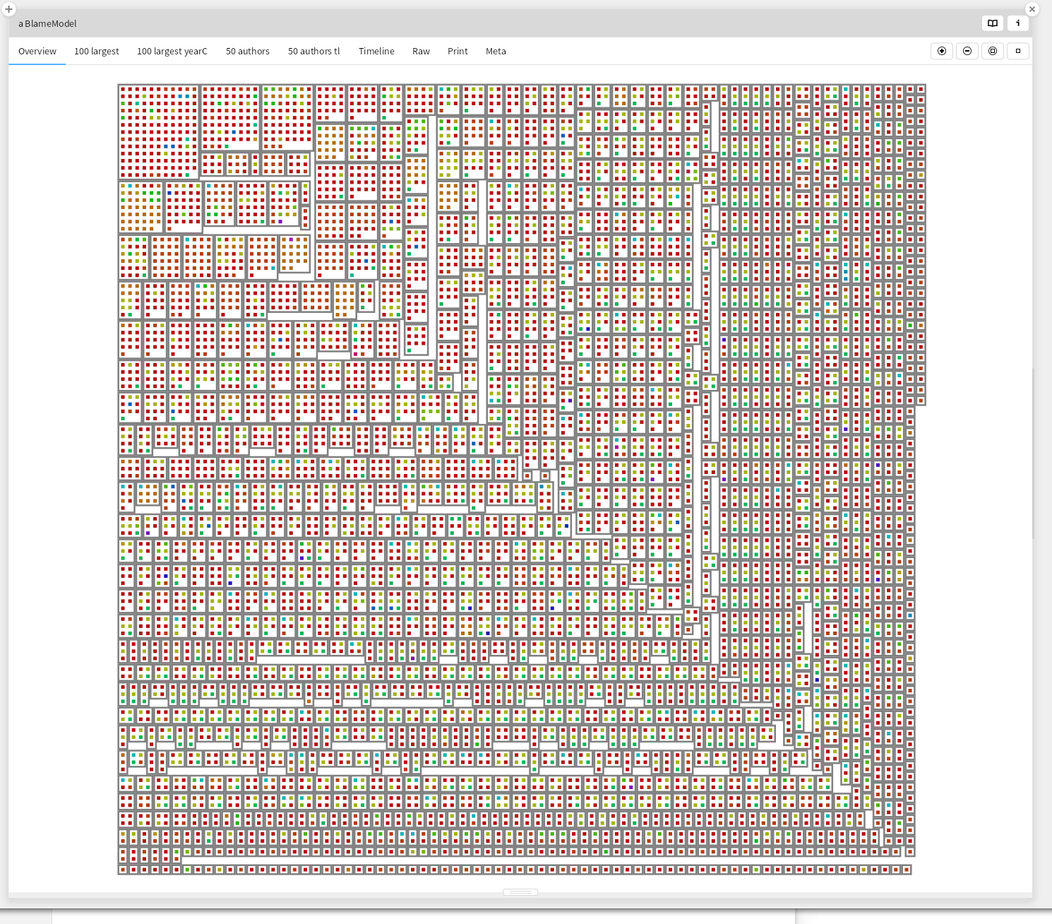
Overview
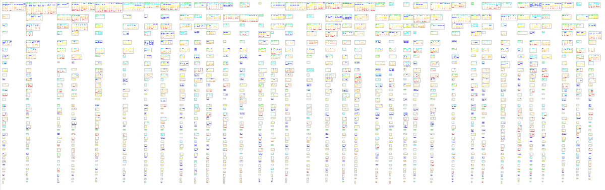
We can take a look at a first overview of the repository
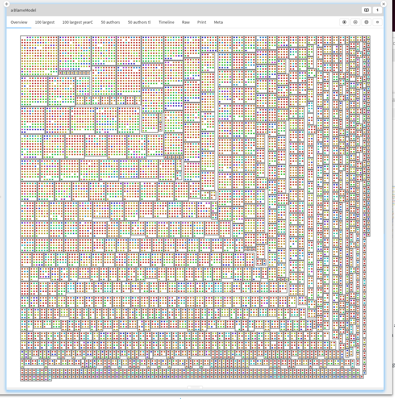
For all the java files, show for each commit the author, for the 50 authors with the most commits. We see here that for most files, there are many different committers. That is a good sign, suggesting that multiple people know how to make changes to the code base.
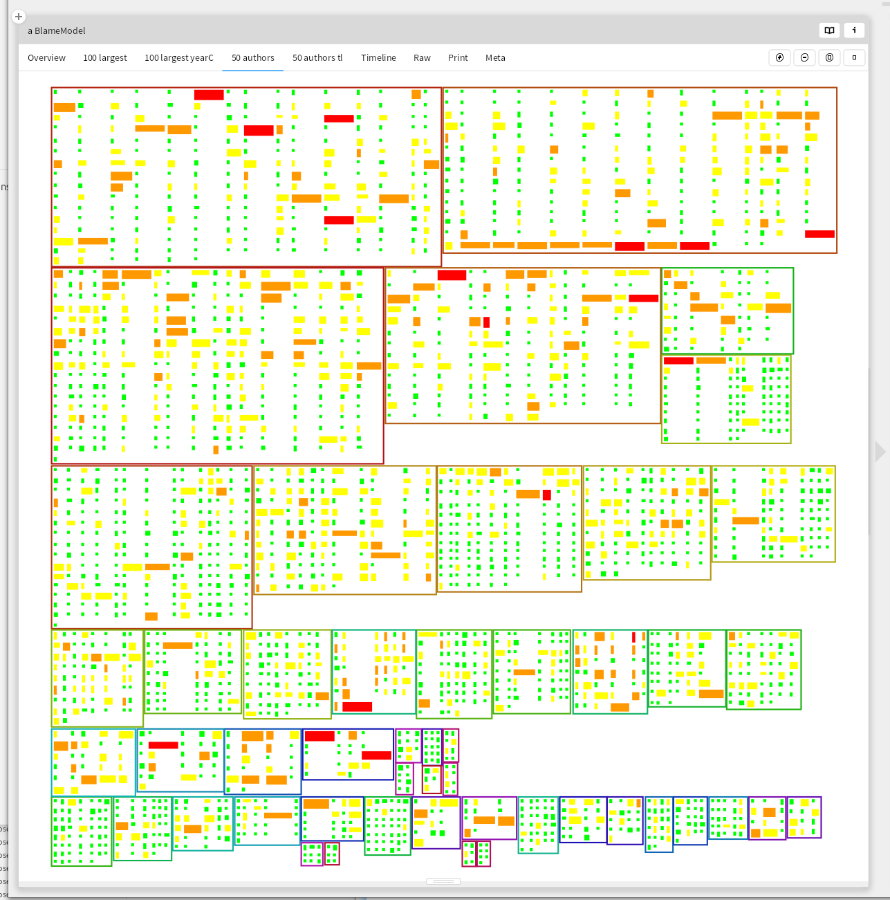
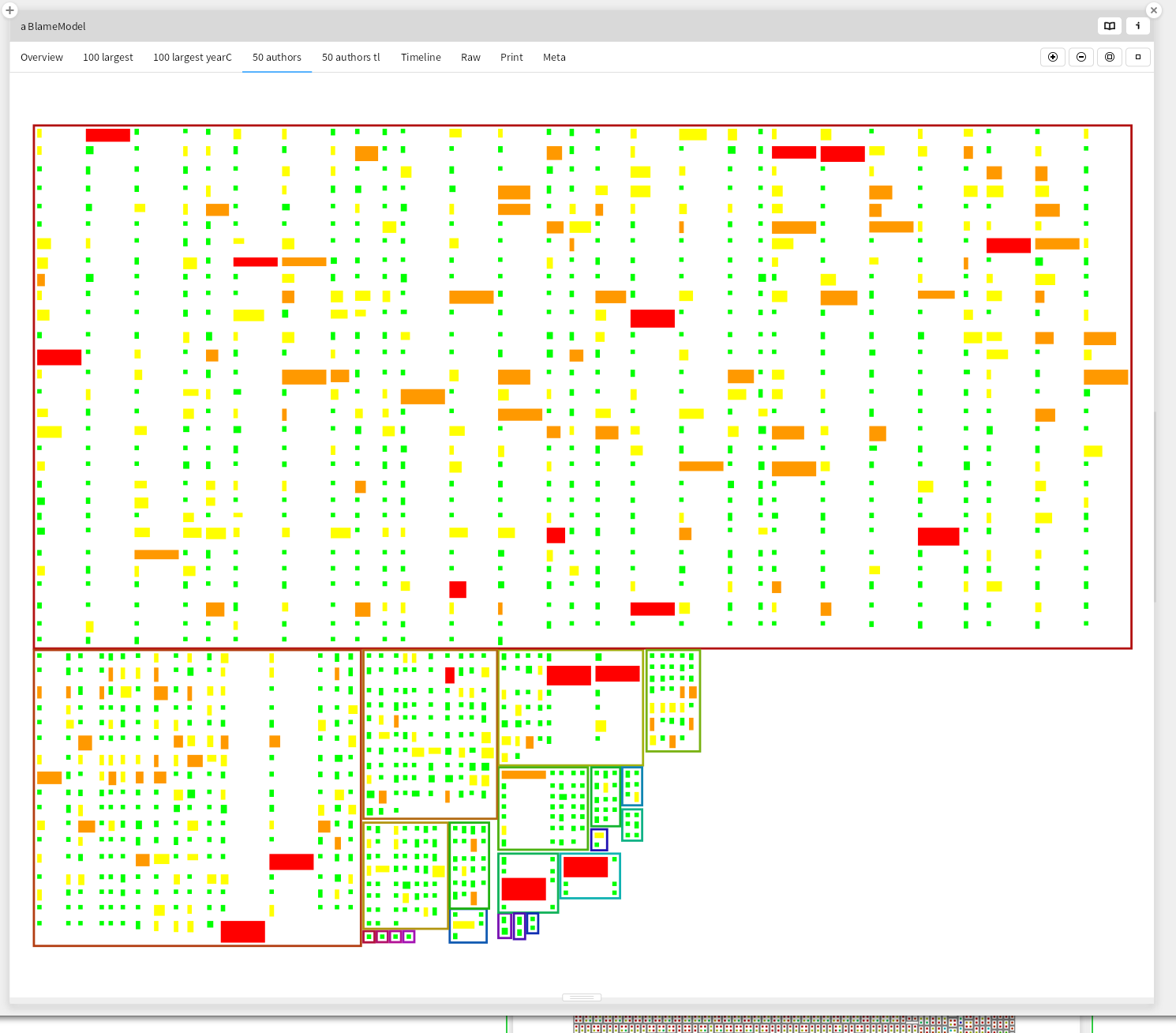
50 authors
Then take a look at the 50 authors with the most commits. Most commits are small, and there is no trend of them growing. The second most prolific author seems to have started with some large commits. Smaller commits are easier to review, but sometimes a refactoring results in lots of files being changed in a very similar way. This visualization makes no distinction between those, and large commits that add lots of functionality in one big (difficult to review) step.
| Files | Lines | Color |
|---|---|---|
| 50 | 1000 | red |
| 20 | 200 | orange |
| 5 | 50 | yellow |
| 0 | 0 | green |
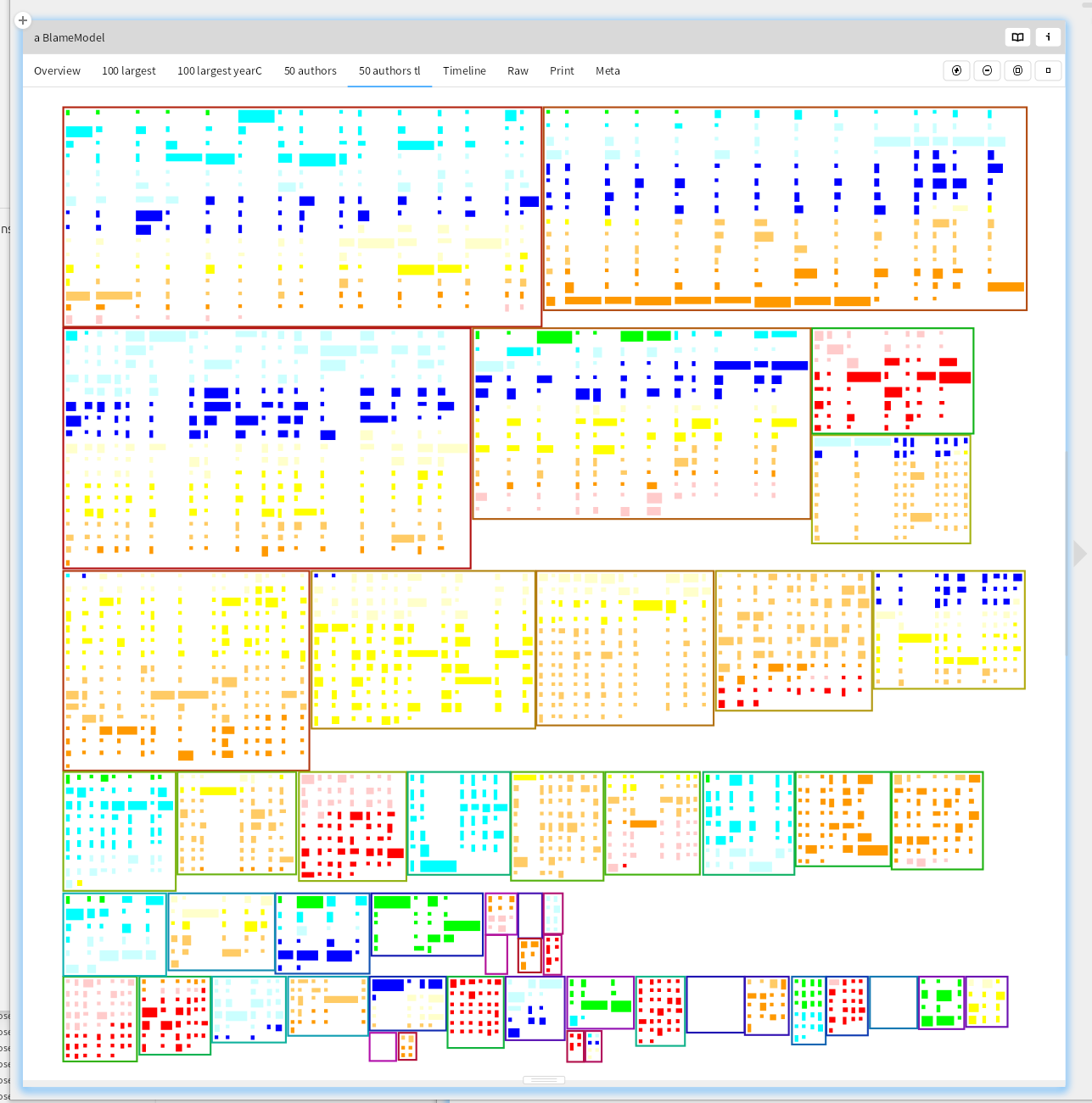
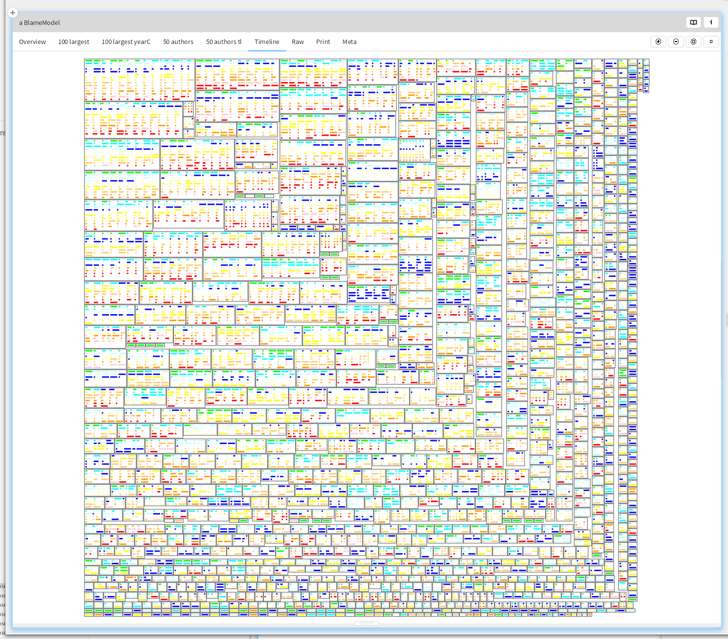
50 authors timeline
By coloring the commits by age, we can see that there has been quite some changes in the team. 3 of its recently committing members have a long history in the project, but there seem to be quite some people no longer involved.
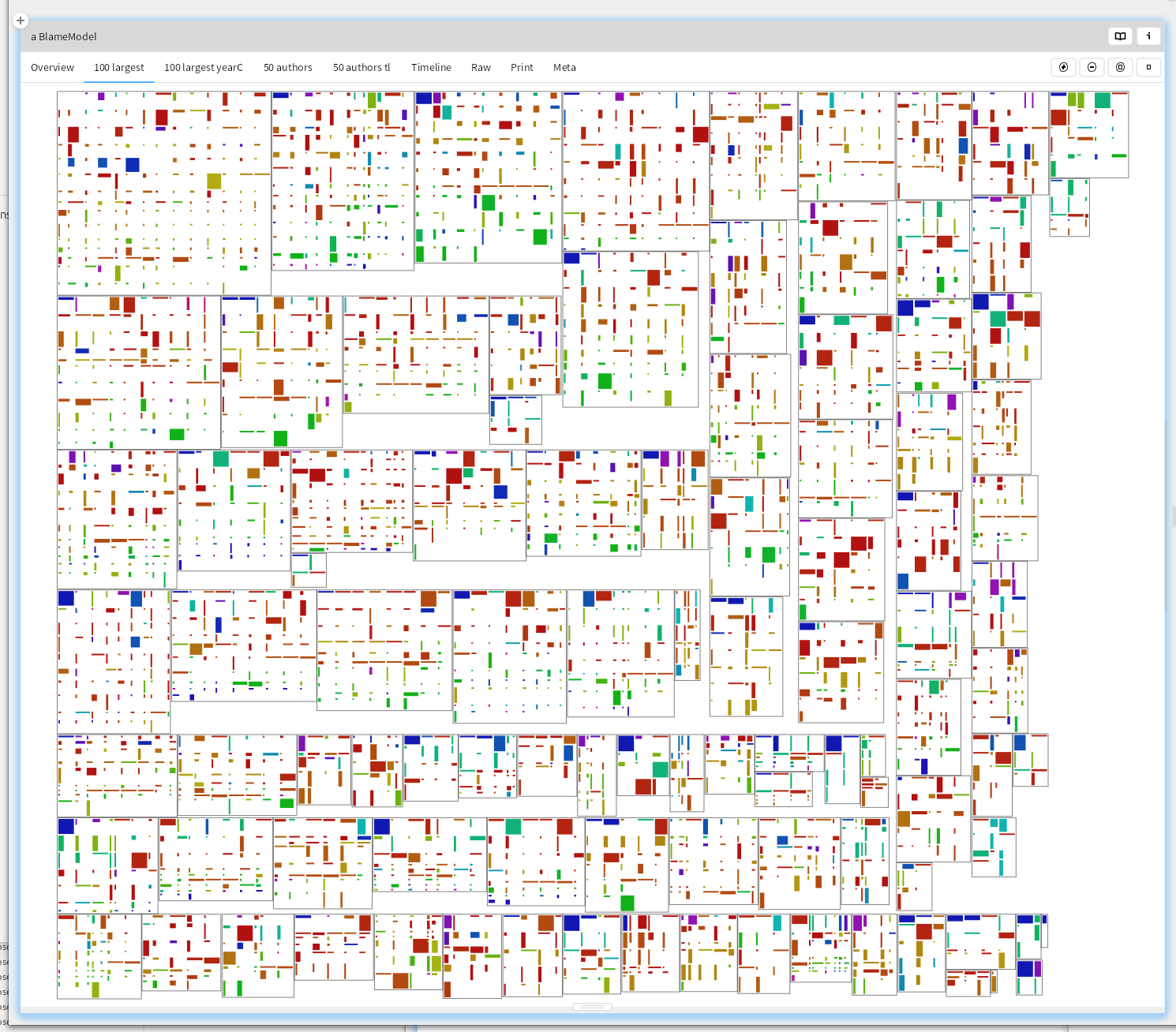
100 largest files
What changes are made to the largest files? Large files with lots of changes might be choke points, or indicate modularization issues. A glimpse seems to show one of the committers having made quite some larger changes, and looking back at the 50 authors timeline shows no recent commits.
Timeline
For all files, show the commits by age. This repository sees continuous development
What do you do with this?
If you apply these kinds of visualizations to many repositories, you start spotting things that look out of the ordinary. It is easy to customize the visualizations, because they are only a few dozen lines of code. The total package is 340 lines of code. It is also often needed to customize the visualization and filter some less relevant directories or files out to be able to better see what is going on.
The first time I needed it, the developers had been long complaining to management that there were parts of the software they didn't understand well, and only the original developer was able to make significant progress. That showed up in a visualization similar to the first overview as an area that was dominated by one color. Something like
But here there might be a few others with sufficient knowledge
Sadly, management experienced such a pressure to deliver that the right measures were not taken to reduce this knowledge gap. I hope this tool can help you understand and explain the code you have to work with, or at least help you raise and answer some interesting questions about the code and the people working on it.